Blog
Locus - Spatial Music Notation
This document introduces a new music notation symbol that allows composers and orchestrators to use sound spatialization as a composition and orchestration device. Download the PDF version here.
History of Sound Imaging in Music
Since the early days of music notation, composers and concertmasters have specified the physical placement of musicians in order to manipulate the music’s imaging pattern (spatial footprint). In the 19th century, as the size of orchestras grew, the conductor emerged as a crucial figure in determining the modern orchestra seating. One key figure who experimented with this new thinking behind orchestra seating was Leopold Stokowski, the conductor for the Philadelphia Orchestra. He tried various seating placements and constantly received audience feedback, who were often outraged by his unconventional placements. When deciding on a seating chart, Leopold often took into consideration the visual footprint of musicians, placing the more active, moving strings in front of woodwinds and brass instruments. Another factor in choosing musician placement was based on how each section interacts with the other. For example, if the first and second violins play contrasting figures, a conductor might choose to separate them in order to create spatial stereo contrast. This positioning, however, makes it harder for players to feed off each other since they are now further apart. Since then, many composers such as George Crumb and Henry Brant have used elaborate seating charts extensively to spatialize music.
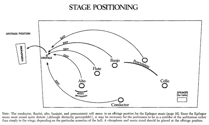
When planning musician placements on the stage, conductors, and composers often draw seating charts (or diagrams) that specify locations for each instrument or section.
Figure 1. Brahms Symphony No. 1, as laid out for Maestro von Dohnyani. (http://andrewhugill.com/)
Figure 2. George Crumb, Night of the four moons
With the invention of audio recording, musician seating was used as a way of mixing the loudness of each instrument by placing them closer or further away from the monophonic recording device. This method, however, did not affect the stereo imaging of the audio reproduction. When stereo recording became popular, musicians started to experiment with imaging in novel ways. A notable example is Bill Evans’ record “Conversations With Myself.” On this record, you can hear Bill Evans play piano on your left speaker while improvising with himself playing on the right speaker. The use of stereo as a compositional device has since become a prominent element in electronic music as well as recorded acoustic music.
Spatial Composition
Due to the increasing accessibility of Virtual Reality technology, spatial audio has become a crucial feature in 360 videos, VR experiences, and games. This technology allows composers to locate precisely each of the composition’s sound sources. Digitally placed sound sources that use ambisonic technology allow composers to move sounds in ways that are impossible to achieve in acoustic settings. For example, it is difficult to physically move heavy instruments around a microphone. Yet with ambisonic technology, it is easy to manipulate where instruments are played. The new ability to widely distribute music with precise spatial imaging allows composers and producers to create music using space as a compositional method. This paper introduces a new music notation symbol that helps composers and orchestrators specify instrument locations and movements, catering to contemporary composers who make use of music notation during the composition process.
Spatial Notation
The “locus” (from Latin, space, location) is a new music notation symbol that indicates an instrument’s location relative to the listener. The symbol can be placed above the staff or next to a dynamic marking. It has 45º of precision Figure 2. George Crumb, Night of the four moons (front, front left, left, back left, back, back right, right, and front right) and three distance indicators (foreground or focus, midground, and background). Additionally, the locus symbol can specify non-spatial sounds, in which case the sounds would be reproduced in both ears at the same level and time.
The locus symbol indicates a composer’s spatial intention while allowing for interpretation by the performers or post-production editors. It allows the composer to specify the position in a manner that is easy to read, fits in the score without occupying too much space while being easy to hand draw.
The Design
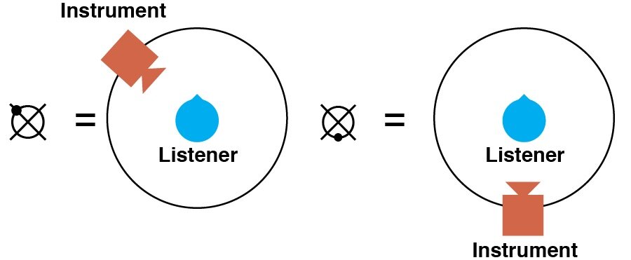
The locus character is composed of three elements: a circle, a cross spun 45º (x), and a dot. Line width and dot size are optimized so that dot location can be more easily recognized inside the locus using small font sizes. When the dot is placed on an intersection between the circle and the cross, a larger-sized dot is used to enhance visibility. The cross is drawn at a 45º angle in order to discourage composers from thinking solely in cardinal direction since, in many VR applications, the listener’s front is relative to their position. The character was designed so that it could be drawn with the least amount of strokes while transmitting as much visual information as possible.
How to Use
The angular position of the dot indicates the angle in which the sound is coming from since the locus symbol represents the player as seen from above (bird’s eye view)
Binaural audio example: (use headphones for spatial perception)
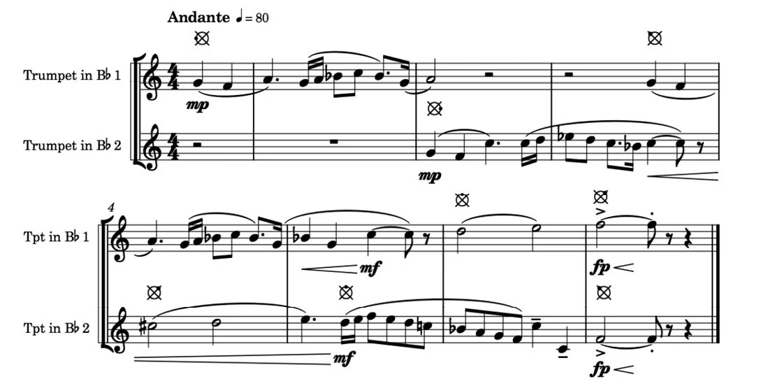
In this example, the first trumpet starts playing on the left side of the listener and the second trumpet begins its melody on the right side of the listener. As each melody phrase ends the trumpets move 45º to the opposite direction until the end. The last note of the first trumpet is played on the front right side of the player (3 o’clock) and the second trumpet performs its last note on the front left side of the player (at 10 o’clock).
Figure 3.
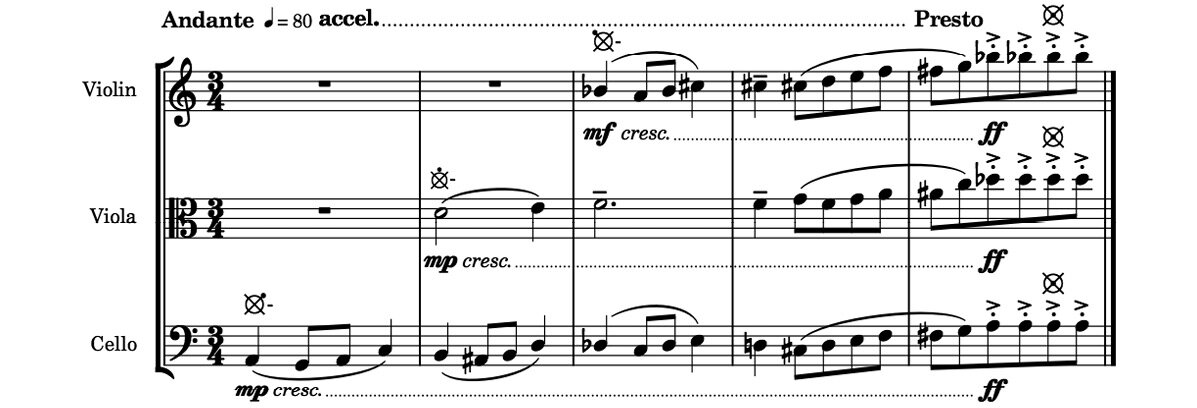
The instrument distance from the listener is indicated by the dot’s distance from the center. Non-spatial sounds can be marked by placing the dot in the center of the locus symbol
In the above example, the instruments start their melody far away from the listener. As the tempo gets faster, the instruments move closer to the listener until they reach a melodic climax inside the listener’s head.
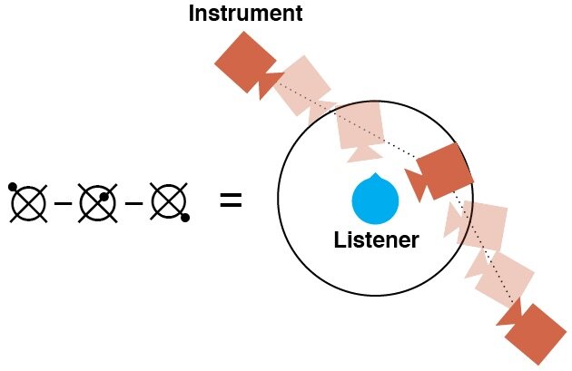
Motion can be indicated using a dash after the locus symbol to show the initial position of the movement and a second locus symbol to show the end of the movement.
In the above example, the oboe plays a playful melody that starts far from the listener and moves towards them. The oboe, however, keeps moving, passing the listener and ending far behind them.
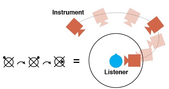
Composers can use curved arrows in order to indicate circular motion in which the distance (radius) between the listener and the instrument is maintained.
Binaural audio example: (use headphones for spatial perception)
In this example the two clarinets play a repeating figure while orbiting the listener, each in the opposite direction to the other. The bassoon which plays a more steady melody line is centered in front of the listener.
Figure 6.
If the composer wishes to move an instrument continuously through multiple positions (keyframes), the locus symbol can be placed between two dashes.
Motion speed and abruptness can be indicated by playing technique texts such as subito or più.
Binaural audio example: (use headphones for spatial perception)
In this example the flute starts slowly, then suddenly changes position, moving quickly between locations.
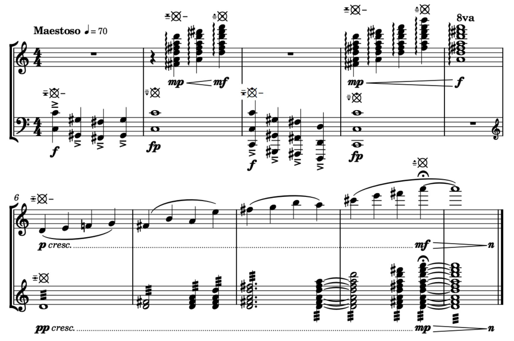
Since the human ear evolved to have poor auditory elevation perception (Trapeau, 2018), the locus symbol does not indicate sound height. However if composers would like to specify the elevation of an instrument, they can do so by writing three dashes on the left side of the locus symbol with a dot to indicate elevations such as: below the floor, below ear level, ear level, above ear level and far above ear level.
The example above shows how spatialization of sounds can help relate music to programmatic themes. In this case, a call from heaven is represented by harp arpeggios (top staff) played from above the listener. The excerpt ends with a slow melody that ascends both in pitch and position joining the harps.
Although the locus symbol was created in response to the wide availability of ambisonics sound format, it can also be used in live settings where the stage or setting allows for musicians to surround the audience. In this instance, musicians are given parts with locus symbols representing the audience’s position relative to them as opposed to the conductor score, which is marked with the musician’s locations relative to the audience. Vocalists and portable instrument players can even be given motion markings, though depending on the size of the setting, they must be given enough time to reach their next position.
On the link below you can download the score for “Here There Here There,” a short four-hand piano piece composed using space as a part of the compositional process.
Here There Here There
Below is a spatial music piece for piano four hands written by Luís Zanforlin. This piece was spatialized in post-production using a binaural imaging plug-in
The link below contains a PDF version of the score
Binaural audio example: (use headphones for spatial perception)
Non-spatial version: (stereo)
How to use the locus symbol on notation software
There is a multitude of ways composers and orchestrators can use the locus symbol in digital scores. At this time, none of the major notation software has an official way to implement the locus character. For this reason, I’ve created a downloadable font type that includes the locus typeface that can be easily employed in most music notation software.
Download Locus Typeface
On Windows right click on the .ttf file and click on Install
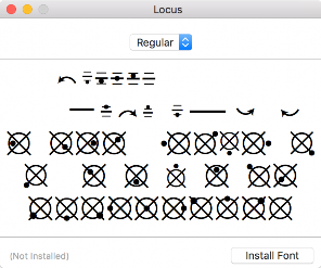
On Mac double click the downloaded file and click on “Install Font” (Figure 7)
Figure 7
The font file is mapped to cardinal positions on the keyboard (Figure 8). The close position symbols are mapped to the “w, a, s, d” keys. The median distance position symbols are mapped to the keypad numbers “8, 6, 2, 4.” The far position symbols are mapped to the “u, h, j, k” keys. Elevation symbols are mapped to the capitalized keys “E, D, C, R, F, V, T, B.” The motion symbols are mapped to the capitalized keys “-, Q, A, S, Z, X.”
Figure 8
Dorico Tutorial:
Download the locus font and install it on your computer.
On “write” mode select a note where you wish to insert the locus symbol and click on the text tool button (the letters “abc” on the right sidebar or by using the shortcut “Shift + M”, Figure 9).
Figure 9
Change the default font to “Locus” and type the corresponding note on the keyboard (Figure 10).
Figure 10
If needed, you can edit the symbol’s position at the properties menu on “Engraver.” mode (Figure11).
Figure 11
Finale Tutorial
Download the locus font and install it on your computer.
Open Finale and click on the “mf” button on the tools menu (Figure 12) to open the “Expression Selection” window (Figure 13).
Figure 12
Figure 13
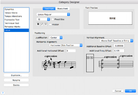
Click on “Edit Categories” to open the “Category Designer” window.
Select the “Technique Text” category and click on “Duplicate”. Name the category “Locus” (Figure 14) and change the “text font” to “Locus Regular” (Figure 15)
Figure 14.
Figure 15
Click the “OK” button and select the “Locus” category on the “Expression Selection” window.
Click on “Create Locus…” at the bottom of the window.
Figure 16
Type the corresponding keyboard character in the text field in order to create a symbol (Figure 16).
Repeat this process until all available symbols are created.
Figure 17
Double click a symbol in order to place it into your music (Figure 17).
Sibelius Tutorial
Right-click on the region where you wish to place a locus symbol and select Text/Other Staff Text/Plain Text (Figure 18).
Figure 18
Select the Text menu on the top bar and change the text font to “Locus” (Figure 19).
Figure 19
Type the corresponding locus symbol on the keyboard (Figure 20).
Figure 20
References:
George Crumb, Night of The Four Moons : alto, alto flute (doubling piccolo), banjo, electric cello and percussion (one player) New York: C.F. Peters, ©1971
Seating Plans. http://andrewhugill.com/manuals/seating.html Accessed 14 Nov. 2018.
Trapeau, Régis, and Marc Schönwiesner. “The Encoding of Sound Source Elevation in the Human Auditory Cortex.” The Journal of Neuroscience, vol. 38, no. 13, Mar. 2018, pp. 3252–64. Crossref, doi:10.1523/JNEUROSCI.2530-17.2018.
Luís Zanforlin, Spatial Music Examples 1-7, luiszanforlin.com ©2018
Why so many VR experiences do Snap Turn wrong
Last week, Wyatt and I were talking about a phenomenon that occurred as he walked through an early level of Gaia, our virtual reality immersive story. He told me he was teleporting his way through a cave and when he snap-turned, to better adjust his view, he passed straight through the virtual cave's wall onto an infinite fall.
Last week, Wyatt and I were talking about a phenomenon that occurred as he walked through an early level of Gaia, our virtual reality immersive story. He told me he was teleporting his way through a cave and when he snap-turned to better adjust his view, he passed straight through the virtual cave's wall into an infinite fall.
He was describing a bug in our experience, a bug that I had actually encountered before, not just in Gaia but in many other virtual reality experiences. So I decided to investigate what was happening, and came across a very interesting snap turn phenomena. But before I tell you all about it, what is a snap turn?
What is snap turn?
Moving through virtual reality is a weird thing because it often involves two kinds of motion, the one you do with your real-life body and the one you do by pressing buttons on a controller. So how does this work? Imagine you are on the last seat of a bus. When you walk to the front of the bus, you've moved through space, and traversed part of your journey. Walking through the bus is kind of what happens when you walk inside your room while wearing a VR headset: you've moved both in the real and virtual world, and like a bus, the space you can walk around is limited. When the bus drives through the world, you are also traversing the world, except that in this case, the bus driver is doing all of the work. Being driven by a bus is equivalent to pressing a button on your joystick and moving through the virtual world while standing in the same "real place". In virtual reality, we call that bus the "rig." So what happens when you want to turn around in VR? The same still applies, you could turn your real body to see what's behind you in the virtual world, but because most headsets have long cables attached to them, you would quickly find yourself tangled with wires. The alternative is to turn the entire bus, often by 45 degrees in one click of a button. We call that a "snap turn," and this locomotion system can be found in most popular VR titles.
Snap turn phenomena
So why did snap turning caused Wyatt to fall through the world? When I programmed the snap turn system for Gaia, I started by simply rotating the bus by 45 degrees when the player moves the joystick left or right. If the player happens to be in the very center of the rig (or bus) when they snap turn, they'll have successfully turned around the virtual world, maintaining the same position. The problem occurs when the player walks with their real body to the edge of their "bus" and then snap turn. The bus spins on its axis, but they’re not in the center of it any more — so as well as rotating, their position also gets moved. Perhaps even through a virtual wall.
Why is it so common?
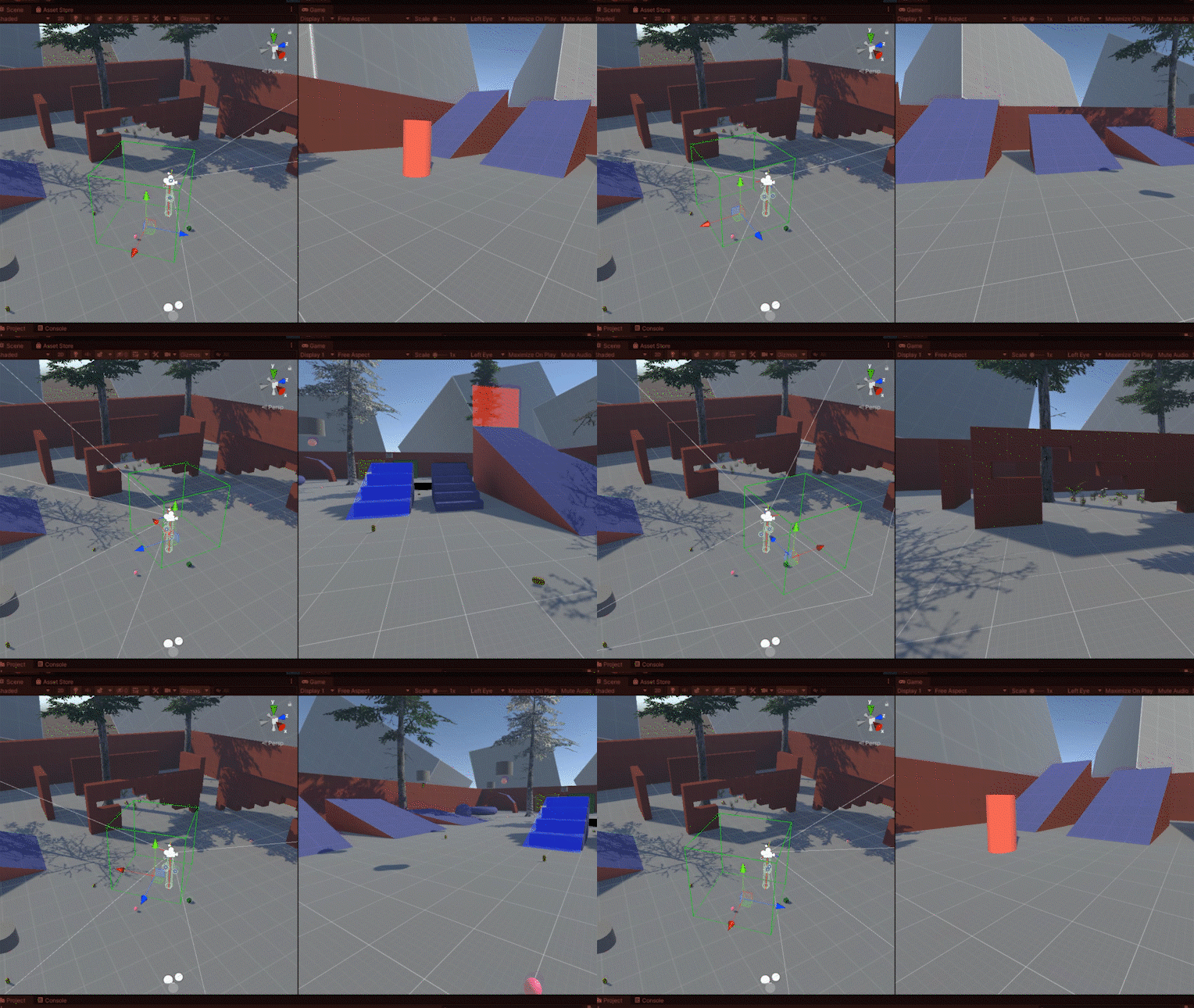
So why so many games and VR development tools do it wrong? I believe it has something to do with the fact that most programmers set up their VR systems so that their computer chair is at the center of their rig (bus). When they play-test their snap turn it looks like they’ve rotated around their head. But not everyone stays sitting down for the whole time they’re in an experience. The other factor may be that most programmers, including me, create special “sand box” worlds for developing their locomotion systems. These worlds are environments full of ramps and obstacles to test the functionality of locomotion, but they are often wide spaces in which the play-tester is unlikely to find themselves next to a wall and snap turn their way into the virtual void.
The solution
When I realized snap turning wasn't as simple as just rotating the rig, I came up with another easy and intuitive solution. I would snap turn in three steps. First, I'd record the position coordinates of the player's head before they perform a snap turn. Then I'd apply the rotation. And finally I would reposition the bus so that the player's head is back at the original recorded position. All in the blink of an eye. I thought the final step of moving the rig to a position so that the player's head would involve something like recording the distance between the player and the center of the bus, which we'll call p, and moving the bus to the desired location subtracted by p. This is essentially the calculation I had to do when designing Gaia's teleportation system.
But when I started to draw this system on my whiteboard I quickly realized that things were more complicated than it seemed. I drew the three steps, recording the initial position, rotating the bus, and moving the bus, but no matter how I looked at it I couldn't find a consistent formula that would move the bus to the correct location that worked for both clockwise and counterclockwise rotations. The solution had to be something more involved, some form of axis-dependent rotation that would do all the steps in one simple gesture. Something mathematical. That's when I came across a simple code command called "RotateAround" that received as input the rotating object (the bus) and the position of the rotation axis (the player's head) and in a magical one-step process it snap turns the player while maintaining its position.
I'm going to be honest with you, I don't fully understand exactly what “RotateAround” does inside its code. Virtual rotations are based on quaternions which are unintuitive mathematical abstractions of angles and axis and I am not good at math. In fact, what I love about programming is that computers do the math for you and you often don't need to have a clue about how things work — you just need to know how to use it.
If I can think of any takeaway from the experience of developing a good snap turn system it is that simple things are often harder to build than they look, hard problems sometimes have easy solutions, and sometimes good programming is more about understanding the outcomes than understanding the code itself.
Sketching Music for Immersive Media
How Luís Zanforlin wrote orchestral sketches for Gaia, Maku XR's upcoming virtual reality experience.
Musical Ideas
When we started working on Gaia, Wyatt and I were having lots of conversations about the development process we were going to apply to this project. Out of these conversations, the one thing we were both in agreement with was that we needed to get a good sense of the tone of the project early on. This decision led me to want to create a variety of short music bites that explored the possible musical colors and themes we could use to guide us in developing the visual language of Gaia.
Writing the music bites started with me researching reference material that I thought would work well for Gaia. I knew I wanted the score to be mostly orchestral with sprinkles of synthetic instruments and natural sound. I looked through my scores and found lots of interesting moments I felt represented the feeling we were looking for, some of it came from big classical composers such as Bartók, Stravinsky and Persichetti but I also found some exciting new orchestral writing in more contemporary pieces such as Anna Clyne's "Night Ferry."
The Sketch
After getting a good sense of the harmonic language and general orchestration ideas I wrote a number of quick sketches on paper that explored quick musical moments. I don't really have too strict of a sketch writing process, in this case, it ended up being groups of four or six staff sketches with the instrumentation written above the notes rather than the conventional one staff per instrument class convention. I also need to write the sketches away from the piano so my mind won't gravitate towards musical ideas that just feel good to play with my hands.
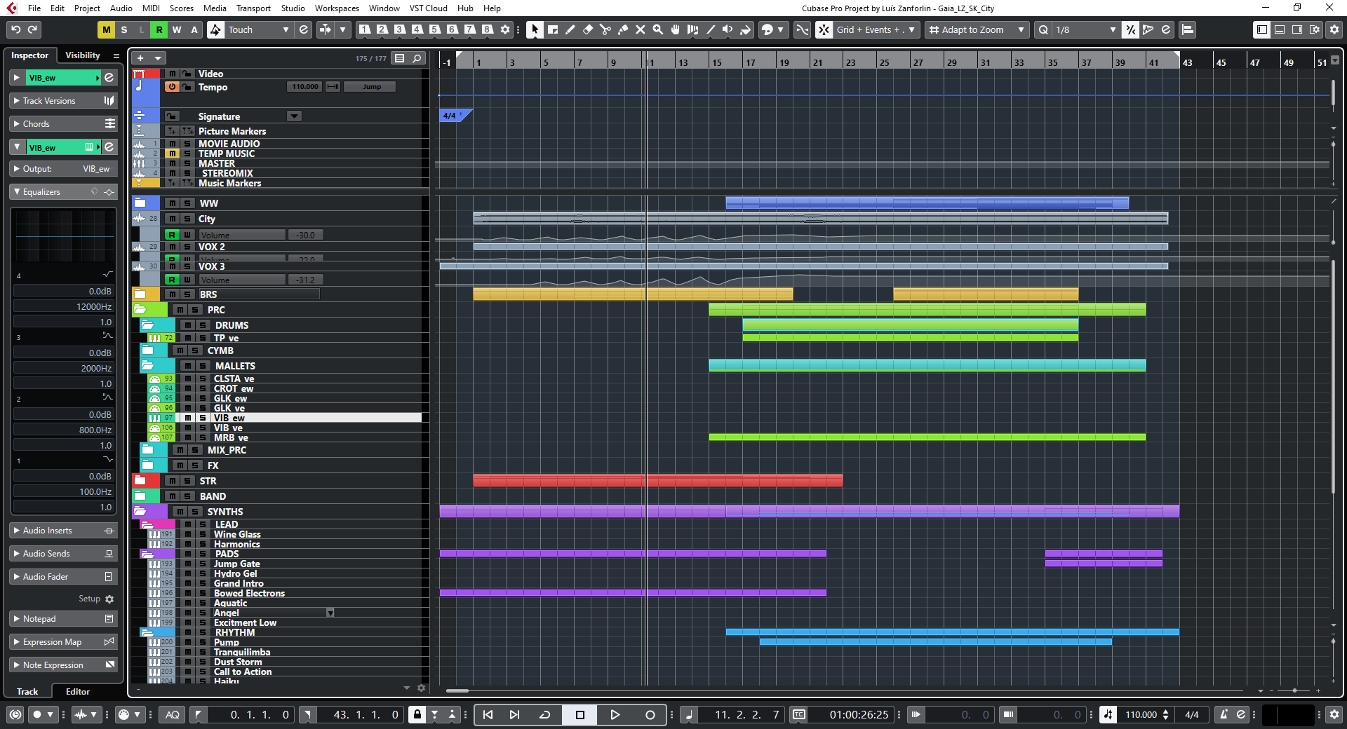
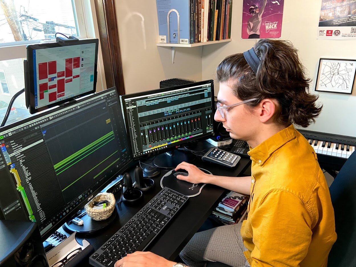
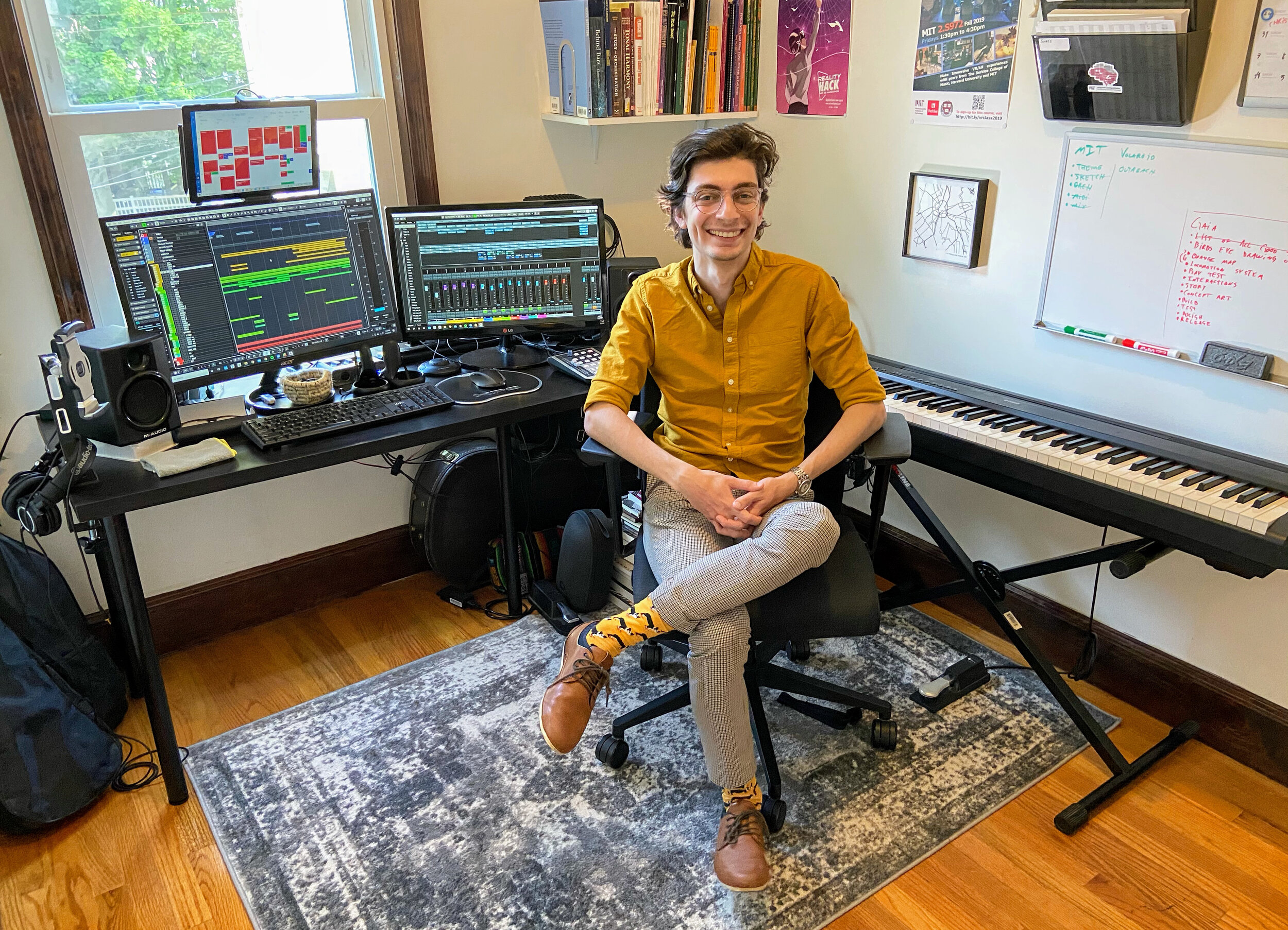
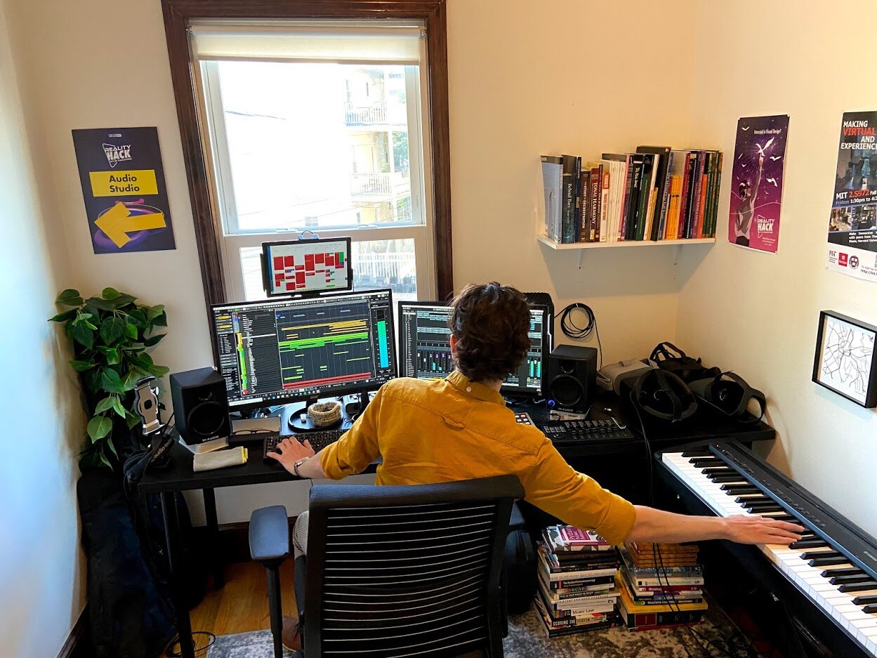
Once I had enough ideas written down I fired up my DAW (Cubase) and put together an orchestral/synthetic template I felt was versatile enough to mock up all of the sketches. To make a quick template I just keep a file on my computer with all of my virtual instruments so I can easily duplicate the file and just delete the instruments I know I won't use. This makes it so I don't have to worry about recreating all of the signal flow every time I want a new template.
Mock-up
The final step is to perform the mock-ups on my MIDI piano and iterate on the ideas until they sound, and most importantly, feel like Gaia. This is the most fun part of the process because it is when you notice how easily one note can swing the entire project into a completely different direction. That's when you realize you already know somewhat clearly what you don't want it to sound and feel like and the emotions you do want it to convey. This is also when I start sharing some of the ideas with Wyatt and get to be inspired by his input and reaction to the sketches.
Main musical theme
The "main theme" which is in no way going to be the real main theme of Gaia, is my musical attempt of representing a universe trying to burst into the big bang a few times before it succeeds. I found that the more dissonant harmonies on the burst attempt combined with the Bartók Pizzicato would give it more of mysterious energy to it. Once the big bang happens the music goes into a classic "Hollywood style" cadence with lots of brass instruments and shiny percussion.
Music Bed
The "music bed" bite is more of a resting piece of music that could be used during puzzle scenes where the player is more likely focused on a task rather than the story. Stealing from minimalism felt like an obvious solution to this idea due to the constant repetition but it also allows for interesting musical interruptions to dynamically com in as the player performs a task.
Industrial Music
The "humans" track ended up being a more experimental music bite. I wanted to see if it was possible to bring in sound effects and human ambient tracks as musical elements. In this example, I routed the sound effects into a series of buses that I could control with a fader and modulate its volume as I would with a musical instrument. I'm not sure how I feel about the ambient blend as it is but I like what it does to the music so I'm thinking about exploring other ways I can modulate the sound effects to make them more musical. This is also where I played with the idea of layering synths into the score.
Impact Music
And finally, just for fun, I wrote some music for a potential meteor impact level. A timpani solo over tremolo low strings came out as more of a fun conceptual idea rather than something I heard in my mind and sometimes that's just the way to go. I'd like to incorporate some fun numerology or mathematical ideas into the timpani solo. I played a bit with the Fibonacci sequence which is a go-to for musicians but as we further develop Gaia, I'm sure we'll come across a mathematical principle that relates to the early universe and could more appropriately fit this piece.
What’s Ahead
I have no idea how many of these ideas will make it to the final version of Gaia. We may even change the entire tone and feel of the project as we further work on it but I think having a few musical sketches helps guide my ideas. Most importantly, having sketches lets me put off thinking about music while I work on the programming side of Gaia knowing that when it comes time to write the music I'll already have a starting point.
Building a Tree
Last week was such a welcome break from screens. I finished most of a pencil, all of its eraser, and filled up a sketchpad. Little pink eraserpoops litter the floor around my desk, each a tiny shrine to an idea invented and discarded on in the rapid, playful process of prototype iteration.
I’ve been living in a make-believe world where you get to play a humble god who lives to serve its creatures. Now I’m trying to make it real.
Luis’s pencil-and-paper strategy worked a charm. The less effort I spent building an idea, the less attached I was to it when it didn’t work, and the easier it was to change it into something better. By the end of my 40th and final chungus last week, I’d finished drawing the designs for every scene (“level”) in Gaia, we’d figured out how to simplify the mechanics to something that a UN member could enjoy, and written a truly crushing-yet-hopeful end to the story. This week it’s time to digitize all of it.
The process of paper-to-vr is a bit bizarre. Check out the video. I import my sketch into Unity, then use software called Probuilder to draw the level in digital space. Step one was learning how to use Probuilder. Step two was building the level. Step three through a million will be making the level actually feel like a story.
When you reach the first room in the tree, you’ll have to pick up buds and throw them at a bare branch. When you hit your target, they’ll spring open into leaves and the tree will thank you for helping it eat. We’re flipping the idea of shooting on its head by taking a violent mechanic and making it vital for sustaining life.
But right now, we're just moving through hallways picking up cubes. Art, which is to say, everything that’ll make it actually feel like you’re inside a tree instead of a concrete bunker, comes very last. We’re a month (months?) away from that. Now is the time to make the computer act like the make-believe world we have in our heads.
There are too many ideas and plans swirling in my head to share here. But Gaia is shaping up to be a deeply unifying, gratifying, and soul-expanding participatory story. I’m so excited that we get to work on it.
Now we just need to figure out who wants to pay us to make it.
VR Without a Headset
Luis’s suggestion seemed silly, so I tried it. Wonderful ideas often hide behind a veneer of absurdity.
“Let’s build Gaia using just a pencil and paper,” he said.
“But why,” I asked.
It was so easy to prototype things in VR. I was already imagining building a simple world to float through using my familiar suite of software.
His reply was something noncommittal, “Let’s just try.”
So I dug through my moving boxes for a sketchpad and pencil, and went outside.
***
We’re now thinking about Gaia as a linear story that gives the user agency over how they move through it. Not a movie, which has a linear narrative but doesn’t give the user control over how they view it. Not a game, which lets the user win or lose, and might not have much story. This will be something in between the two. An active story, a story that requires you to learn and acquire skills in order to complete each chapter and get to the next. Our hunch is that by asking you to give us your effort, we will be allowing you to more fully embody Gaia as a character, and empathize with it, than if we simply showed you the Earth’s history from Gaia’s perspective.
Our first version of Gaia was prototyped in VR, using a combination of Unity models and sketched environments I made in Quill. VR is wonderful to prototype in. I’ve sketched everything from trikes to houses, and the infinitely scalable virtual world lets me effortlessly sit on the trike and walk through the house. So prototyping on paper seemed like solving a problem that didn’t exist. But as I set pencil to paper, I saw I'd been blind to the problem.
As easy as it was to prototype in VR, I was still bound by the rules of the software. And it was a subtle cage. I knew that this chapter would start with you embodying a fish, in an underwater cave. If I were in VR, I would have started to model the cave and the fish and an hour later I would have only the starting point of the chapter. But with pencil and paper, I drew an outline of the cave and fish in three seconds, then had to solve the real creative challenge -- what next?
Hmm, what about introducing a decision point? It could be helpful to make the user/viewer feel agency. Perhaps a decision that wouldn’t impact the linear narrative, such that whether they’d choose the left or right tunnel, they’d still end up at the same place. That kind of choice would create a sense of agency that is so important for feeling like you’re discovering something new.
And so my map unfolded, in fifteen minutes -- caves with spiky urchins that needed to be slipped past, a big hungry octopus with you on its menu, and a vast section of open ocean that you’d have to navigate in order to get to the safety of your coral home. Looking at the drawing I realized there was no way I could have designed this if I’d started in VR. So much of this story existed in my imagination. The low fidelity of paper drawings allowed a high-fidelity experience to form in my mind. It also led to a wild insight: you had to start the chapter as the octopus.
Seeing everything from the top down, I realized that in order to empathize with all life forms as Gaia does, you must be able to embody those at different ends of the food chain. If you start the chapter thinking that fish are food objects, what will be the emotional effect of being reborn as a fish? Will you realize that all food is a living thing until you eat it? And as the fish, will you understand that the octopus isn’t evil, it simply has different needs from you?
When I shared the concept with friends they were all able to imagine the chapter in their heads simultaneously -- something that couldn’t happen if I’d prototyped it in VR and popped them in one at a time. And Lara suggested something wild -- what if the next prototype still wasn’t in VR -- what if we acted it out? Seemed preposterous, so of course, I tried (and filmed) it.
Now I’ll never make a VR story any other way.
Digitizing Reality
Three years ago I picked up my camera and scanned something into VR for the first time: a succulent. Back then I was just teaching myself photogrammetry. Today it's one of my strongest skills.
I took the pictures from every angle I could think of -- up, down, left, right. Then I fed them into my computer and marveled at what came out: a beautiful model of my succulent started spinning on my screen.
The resemblance was striking, even uncanny, but there were differences.
The real succulent was alive. It could grow if I watered it, or die if I forgot. The digital succulent was just an infinitely thin mesh of tiny triangles that ware painted with pixels from the photos I took. Any growing or dying behavior would have to be painstakingly coded into it.
The real succulent pushed back when I touched it. The digital succulent let my virtual hand slip right through.
The real succulent was itself. The digital succulent was just a model of it.
But we use the word "model" to describe a clay figurine as well as a catwalk model -- they're both archetypes of some true form. So perhaps the real succulent was also a model, insofar as it modeled for me when I scanned it. And perhaps digital succulent was also real -- a real digital succulent.
Maybe "real" is a less useful descriptor than "physical." Virtual reality is just an alternative set of things to look at and hear. It may be unbounded by conventional physics but it's no less real once you're in it.
So much has changed in those three years. The technology is actually all pretty much the same. But I've gotten faster and more accurate with my scans, and I've figured out what I want to use them for: to capture beautiful things before they're gone.
When your body is the whole Earth
It was a strange, loving idea: if global problems like climate change feel too big to fix, why not just make you... bigger?
Researchers are successfully tricking people into feeling more empathy for those who are different from them by placing them into VR worlds where they have a different body. Putting abusive men in homes where they're in a woman's body, or putting white people in black bodies are two examples that have shown striking, promising effects on implicit measures of bias. More than just walking in another's shoes, these experiences let you grab with another's hands and stare at a different face in the mirror.
So what if your body wasn't human? What if you were the whole Earth, and your character was Gaia, steward of life? What would it feel like to spark the first amino acids to turn into single-celled organisms? To watch evolution happen on you, on you, because of you? To see that all spiral off the rails after you give fire to apes and in a few short millennia humanity brings it all crashing down?
We've been building this minimum viable product for half a year. It is sketchy and basic, with an emphasis on "minimum." But we've learned a ton from these broken interactions and blocky animations. Like: this piece must be interactive, not a 3D movie. The player needs agency. Yet it must be linear-- we're not trying to branch into alternate realities if the player decides to withhold fire from the apes. Characters are vital, but what should the moon's personality be? And what character should the player be? Will it be too painful to be the Earth?
We still don't know how it should end. The Giving Tree is a wonderful reference for the target emotional state we want to leave each player with: grief, guilt, and gratitude. But will it be too brutal if you are the tree when the inevitable happens, and humans destroy themselves and you as well?
We want this piece to wiggle its way into your gut and nudge you to do more to be a sustainable steward of life, whatever that means for you, and to treasure this tiny blue spaceship we call home.
Now we scrap it and rebuild from the ground up. Onwards.
Half-Life: Alyx in real life
This might look like a video, but it's actually a love letter. To a life-changing VR experience that has altered the way I think about linearity and agency in narratives, and given me an incredible place to escape during the coronavirus quarantine.
It took a team of hundreds 13 years to build this game. I have so many thoughts, but I'll get those down later. I have to go finish playing it.
Update: The format and mechanics of this zombie shoot-em-up game is the backbone of Gaia. We are infinitely grateful to Valve for the gift they gave us by creating it.
Passive Narrative
I was sitting in the sun on a friend's balcony last summer when two new words popped into my head: fixies and choosies. Neither of them are real words. Yet. But hear me out.
With movies, we have documentaries and narratives. Features and shorts. Independent and Hollywood. Film is a 100+ year old industry so its categories have branched and matured into a rich array of story types. I've wondered what a similar primitive storytelling dichotomy might be for VR stories. And I think a key one has to do with interaction.
In VR, unlike in film, you have agency. At a basic level, you have agency to look wherever you want, but what I'm talking about is real agency to go anywhere, pick up things, interact with characters, and change the outcome of a story. To choose what you do, and have your own journey. Some of the pieces we've built give you so much agency that literally no part of the story happens unless you do something. If it sounds a lot like a computer game, you're on the right track, but they're not exactly games, because there's no way to win. I call these Choosies. (Worth noting that even in amazing VR games like Half Life: Alyx, you cannot always influence the story, you can only influence the way in which you move through the story.)
But people don't always want to do stuff. Being an active participant takes effort. Sometimes we just want to veg out and watch Netflix. If VR is ever going to be a viable storytelling medium, we need to figure out a way to tell completely passive stories that don't even require you to look around (though you may, if you please.) I call these Fixies, because the events are totally fixed in time.
I was meditating in the woods when my brain served me up this silly concept: two roommates, one ex, and a very saucy painting given as a tone-deaf housewarming present. We decided to film it using a photogrammetric model of my house that I'd already created, and an Azure Kinect depth sensor to capture 2.5-dimensional holograms. We hired ourselves as the actors because this is just a tech demo. If you have an Oculus Quest, you can download the apk and sidequest it onto yours here. If you have a Rift, the PC build is here.
Skating through VR
The first virtual space I spent hours in was Google Blocks. It's wonderland for builders. A blank canvas that extends in all directions, forward, back, up, down. You hold your hand out, squeeze, drag your hand down, and then a cube appears in the air. Add another few cubes, you've made a house. I made huge cities, giant squids, and glowworm caves during my first couple weeks in VR. I felt like a god, being able to draw a mountain then walk around on it.
I noticed a strange interaction between my virtual space and my realworld space. If I were drawing a palm tree on a beach, and I wanted to see what was to the left of the palm tree (in this case, a surfboard), I could either move my physical body in the physical world a couple paces to the left, and risk bumping into a wall, or I could just drag the digital model in the virtual world over to the right with a simple wrist flick. Head turns were easy to do physically, as long as they were less than about 60°. Turning all the way around was easier to do virtually. And crouching to draw the underside of a beach umbrella burned the quads worse than a corepower workout. Much easier to drag the virtual model so it was in front of me. Leonardo couldn't make the Sistine Chapel's ceiling face up and down like a wall, so he spent months on his back eating paint. But in VR, we can.
Mixing physical movement with virtual perspective shifts became second nature, and finding the right ways to move in VR became an obsession of mine. Because movement means exploration, freedom, agency, control. Adventure. Mobility is fundamentally human. And VR gave me whole new ways to be mobile. But there was a problem.
In VR, movement makes people sick.
Every time your perspective moves through the virtual world without your actual body moving through the physical world, your inner ear will scream at you: "HEY. STOP THAT. I DON'T FEEL ANY MOTION, SO WHY ARE THE WALLS MOVING?" It's similar to being carsick, which happens when you read a book that doesn't look like it's moving, at the same time as your inner ear feels the car rocking. Your well-intentioned ears send a signal to your tummy saying "STUFF DOESN'T MATCH, SHUT IT ALL DOWN" and you get nauseous. Bummer.
I spent so much time in VR those first few months that I got over motion sickness. But dedicating hours to feel nauseous every day is a tall ask for the general public. So VR developers tried to figure out the least awful way to move through virtual spaces without actually moving through physical spaces. Some decided that you just shouldn't design experiences that allow virtual movement. Others decided that you should only be allowed to move virtually if you're moving physically. One clever guy even figured out how to map your real room and design a game's map to fit your space, so you move around your room but it seems like you're exploring a whole world.
The most common solution people landed on was called "teleporting." You aim your controller ahead, and a line shoots out from it. Your perspective will move to wherever that line touches the ground, in the blink of an eye. It solves the motion sickness problem because your eyes never see space moving around you, so your inner ear doesn't care that it feels no inertia. You just teleport, and you're there. But it has always struck me as disappointingly un-immersive. We don't move around the physical world by pointing and blinking; we move through the world gradually, by walking on our feet or rolling on wheels, and we get to look at objects shift in our vision as we pass them. If only there were a way to trick our inner ear to let everyone do this in VR.
I was in Tokyo last year at an award ceremony for a VR piece I made about my home, and I met a wonderful developer named Hawken. He too was dissatisfied with teleporting. He'd come up with an alternative: could the user move through virtual space by leaning their body in physical space? That way, their inner ear would get a little activation because it would literally be moving, and it might be enough to keep it from screaming to the stomach. His second insight was that you need a way to tell the VR app that your physical movement is intentional, like by holding a button. Otherwise, any time you shifted weight or looked around, you'd be sliding all over the place.
I told Luis about it and we came up with a simple UX for how it could work. Luis coded it in an afternoon, and it is *wild*. It's not walking, it's not rolling, and it's not teleporting. It feels like skating.
Unclear if it solves the nausea problem, because I don't get motion sick anyway, but it feels incredibly intuitive and downright joyful to lean and skate your way through the virtual world. When I took my headset off, I tried to lean my way into the kitchen for a glass of water. With a sigh, I picked up my feet, and trudged off.


